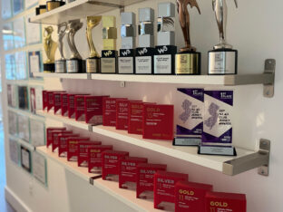
It’s a CRE bling thing.
What’s better than continuously being recognized for outstanding CRE branding and marketing? Not much, really.
read moreYour contact form is a means of communicating with potential customers who visit your site. You may not have given it a lot of thought, outside of placing one on your landing page and responding when someone contacts you.
However, your contact form is one of the most powerful tools for generating highly qualified leads. Without a contact form, there isn’t a clear way to convert a visitor into a lead. There are many reasons a site visitor might not complete your contact form or hit the submit button.
You’re asking site visitors for personal information. If you want their trust, prove you’re worthy of it. List your privacy policies as required by GDPR compliance, add trust badges such as BBB membership and provide an obvious path to contact your company.
If a potential customer believes you to be authentic and trustworthy, they’re much more likely to do business with you.
Contact forms have a low 3 percent conversion rate. However, if you add a contest or some incentive, conversions go up to 28 percent or more. Think about your target audience and what they value. If you sell HVAC services, you might offer a free quote on maintenance packages. If you run a beauty salon, offer a free guide to the best haircut for your face shape.
Think about what ties into your business and what your typical customer finds valuable.

Kraft has a section of their site devoted to recipes, but you can also contact them and subscribe to have those recipes sent to your inbox, as well as coupons for their products. Since those visiting the site are typically people who want to use their products, the freebies of recipes and coupons make perfect sense for their target audience.
Studies show the fewer form fields you require for people to get in touch with you, the more likely they are to fill out the form and hit “submit.” One company went from 11 form fields to four and increased their conversions by 120 percent.
Also, people don’t like to share their phone numbers. Adding a form field for a phone number causes about a 5 percent decrease in conversions.
The color of your CTA button matters. Studies show people respond to different colors in different ways. Some studies suggest red catches the eye of site visitors, but other studies indicate blue or green works best because most people prefer those colors.
The color that works best for you is the one that contrasts nicely with the rest of your color palette and that your target audience responds to. Your best bet is to try the best-liked colors, such as red, blue or green, and run some A/B tests to see how your visitors respond.

The Exterior Company’s submit button on their contact form is a bright, eye-catching orange-red. Note how the color of the button contrasts nicely with the white background. At the same time, the color matches the color scheme of the website.
Note how the logo has orange rooftops over the letters, and the site indicates which page you are on in the nav bar with orange letters.
Forms using drop-down options have the worst conversion rates of all. The more form fields, the lower the rate drops.
Remember, many people access the Internet via their mobile devices. Form fields with dropdowns may be challenging to use on a smaller screen. Even on PCs, people like the convenience of hitting the tab key, adding info and moving through the form quickly.
It’s doubtful that anyone would say they like CAPTCHAs, even if they understand the desire to reduce spam.
However, adding CAPTCHAs for your contact form reduces conversion rates by at least 3 percent. There are other ways to control spam without adding aggravating images a user must choose or letters that are difficult to read. CAPTCHAs are just frustrating.

Maker’s Mark has a simple contact form that is very clear and easy to use.
Note that there is no CAPTCHA or any fancy fields. They do have a field for a phone number, but it is not required. They’ve also added a message box so users can give specific details about their questions or issues.
Even though the word “submit” is traditional for contact forms, it may not perform as well as more descriptive words. When people see “submit” over and over again, the word loses its impact.
However, using a word such as “go” increases conversions by as much as 30 percent. You can even get more detailed and explain what happens when the person clicks the button, such as “subscribe to free newsletter” or “get answers.”
List your contact form last in your navigation menu.
Why? It is the most popular location for the contact form on a website, and users know to look for it in your nav bar. Many sites also put their contact form in the footer. Make the contact form easy to find and easy to use, so site visitors don’t get frustrated.

The perception of the length of your form impacts whether customers fill it out. In an eye-tracking study, researchers found input fields should be about the length of the expected text. A name field, therefore, should be 25 characters or fewer.
There should also be one question per row, rather than multiple columns. Your form should be short, to the point and have a sensible and visually pleasant layout.
Put the time into perfecting your contact form, and conversions will increase. You’ll also have better communication with site visitors. The above elements make a difference in how successful your contact form is.
Change them, test them and see conversions increase.

Lexie Lu is a contributing writer for Splendor Design and a freelance designer. She enjoys writing code and learning about new web platforms. She manages Design Roast and can be followed on Twitter @lexieludesigner.
What’s better than continuously being recognized for outstanding CRE branding and marketing? Not much, really.
read more
While many companies invest in advanced technology, true success comes from harnessing the power of human intelligence and creativity.
read more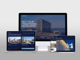
With a new name and identity in hand, Starfield Companies looked to Splendor for a website design that reflects the company values.
read more